WEEK 03: 20th century Avant-garde Art
QUICK REVIEW
Just memorizing the words in this box is not the same as understanding the material well enough to use it in the world, or to do well when you are tested on it. Some of this material is explained in depth starting at the left of this box, or on the main study site.
- The avant-garde was a consciously recognized attitude by artists who wanted to be ahead of their time, break new ground, and also supersede and critique the past values, including both those of high art and those of consumer culture
- On the whole, avant-garde appropriation is not about repurposing or exploiting the great works of past masters in one’s own work, but rather about responding to, incorporating, and mastering through artistic creation the works produced by mainstream mass culture that are competing for people’s attention. The other prominent aspect was cultural appropriation of motifs and techniques from ancient and indigenous cultures.
- You should have a sense of how appropriation techniques were used in four different key examples: Dada, Readymades, Pop Art, and Appropriation Art (1980s movement).
- Dadaist photomontage often involved collage of manufactured media that emphasized the mechanical, consumerist, and manufactured nature of modern Western life
- Readymades where an invention of Marcel Duchamp, who selected banal manufactured items and modified them minimally before presenting them as art; this focus on selection and context was an important moment in the creation of Conceptual Art
- Pop Art took the manufactured media of contemporary life and re-presented it in a fine art setting, often having modified it in more traditional artistic ways (re-painting a comic strip frame very large or silk screening variations on a photo of a celebrity, to take two well-known examples)
- Appropriation Art re-presented familiar images from art or consumer culture as original works with minimal modification in order to make people think about the wider "political" context of the originals and about the nature of appropriation itself in a postmodern world
- Baroness Elsa von Freytag-Loringhoven a radical feminist punk in the 1910s who probably influenced Duchamp in the idea of presenting an upside-down urinal as a work of art. See under The Readymade on this page.
This week's class looks at how appropriation became an important practice in 20th century Western art. It looks at four phenomena where appropriation was key: Dadaist photomontage, Readymades, Pop Art, and Appropriation Art.
The Avant-Garde: What was it?
The title above is ironic. Avant-garde comes from the French for the advance forces in a combat. The idea is that the avant-garde are ahead of their time, breaking new ground. But as a term in cultural history, "avant-garde" suffers the same fate as the Western cultural period it is associated with: Modernism. Ironically, these are now terms mostly associated with the past.
The avant-garde refers, or used to refer, to artists “ahead of their time.” In the early twentieth century, the heyday of the avant-garde, some assumptions the general public might tend to make about avant-garde work would have been:
- it is usually difficult to understand and in some cases hard to relate to; it is challenging
- it is opposed both to traditional high culture and to popular mass culture
- it tends to be politically oppositional to the powers that be
- it tends to be anti-capitalist (Modernist avant-garde; later it is not always)
- it attempts to distance itself from previous artistic practices; it is looking to the future and liberation from the stifling conventions of the present
- it is often self-conscious and intellectual, and at times it is largely “conceptual” (trying to get an idea across) rather than decorative or emotionally charged
- it strives for authenticity (as opposed to the premeditated fabrication that goes on in manufactured culture)
Clement Greenberg, who was an influential theorist and historian of avant-garde art, tended to see mass culture as “phony” because it was commercial – designed primarily to make money or perpetuate media industries – and he showed how mass culture often rips off the new ideas of marginalized and countercultural avant-garde creators to produce more stylish commercial products which the public then takes to be innovative, though they are actually just part of the capitalist culture system with some avant-garde style or irony thrown in.
A lot of avant-garde art involves a reaction to technologies of (mass) reproduction and some ambivalence toward them. When photography was invented, visual artists suddenly had to ask themselves what they could express in their representations of reality better than a photograph could. They developed schools of art in which “photographic” realism was not the focus or in some cases even desirable: impressionism, for instance, tried to create the “feel” of a scene rather than a visually sharp depiction of it. The cubists were trying to convey perspectivism, three dimensional space and movement with the flat, static two-dimensional medium of oil painting. Surrealists focused on the subconscious realm and conveying the insights of dreams and "primitive" and infantile perception, and so forth.
It’s interesting to see how the development of these technologies (photography and the cinema) may have pushed the visual arts to move away from attempts at naturalistic representations of reality (film can capture a more "natural" impression of reality, at least what it looks like) toward finding alternative ways of making people feel and think about reality, and above all about the representations of reality that we often take for reality itself. The representations in photography and video are more easily mistaken for reality than a painting can be!

Avant-garde appropriation practices
Most of the avant garde art that is interesting because of appropriation was trying to make a radical break with the techniques and subjects of Western art since the Renaissance: pictures like The Last Supper or the Mona Lisa by Leonardo da Vinci, or endless takes on naked goddesses lying prone. The Western tradition had featured idealized religious or mythological subjects, landscapes and still lifes attempting to capture moments of nature, portraits of individuals, usually rendered in what today we would call a “photographic” style. The painting was largely “naturalistic” – meant to make paint on camvas resemble "real" or "realistic" things (the goddess Venus reclining looks something like a real naked mortal woman) or to faithfully reproduce a moment of reality (a stormy day in a landscape).
The avant garde instead showed impulses toward making art “non-objective” (not trying to recreate or photographically represent the world) but at the same time toward showing us reality in news ways, to disrupt our understanding of reality as it has been mediated for us by supposedly realistic images.
The avant garde was thus not likely to appropriate much from the great tradition of Western art that had proceeded it (and which it was trying to take to the next level). They might put a mustache on the Mona Lisa, but more often they were trying to bring in representations of reality that had not appeared in Western fine art much between 1400 and 1900. Probably the two most obvious places from which they appropriated were two forms of creative production that could not be much further removed from one another in terms of style and intent: (1) ancient and “primitive” forms of indigenous art on the one hand, and (2) mass-produced consumer media on the other.
"Primitivism"
Although the appropriation of craft art from dead ancient civilizations and recent or still-active indigenous cultures was a form of cultural appropriation, the attitude of most of the appropriators toward the work was highly respectful, if obviously decontextualizing. The figures, for instance, were used as inspirations for portraits of themselves and their lovers. The idea was that humanity (Western tradition) had lost touch with the essential meaning and power of art: spiritual power, raw power, abstract power.
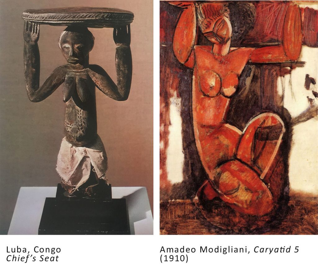
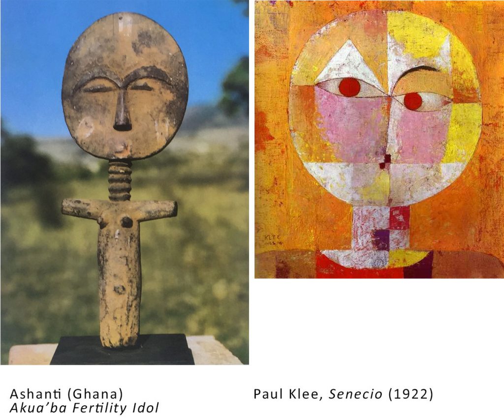
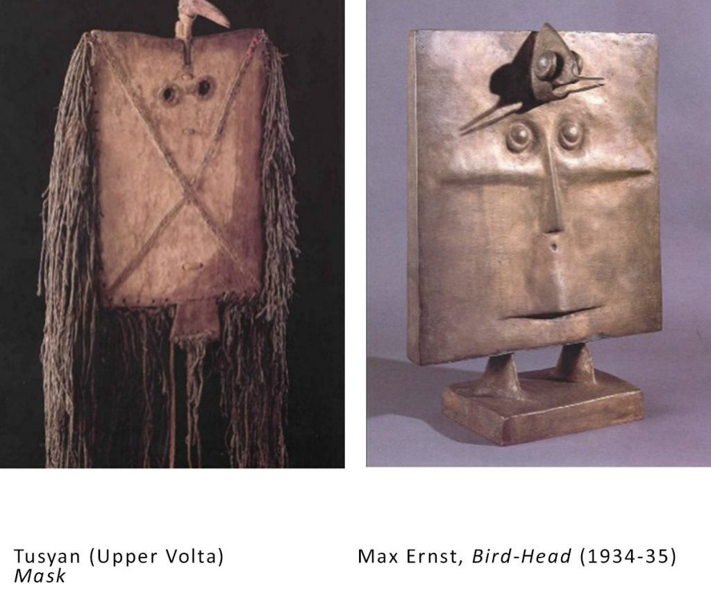

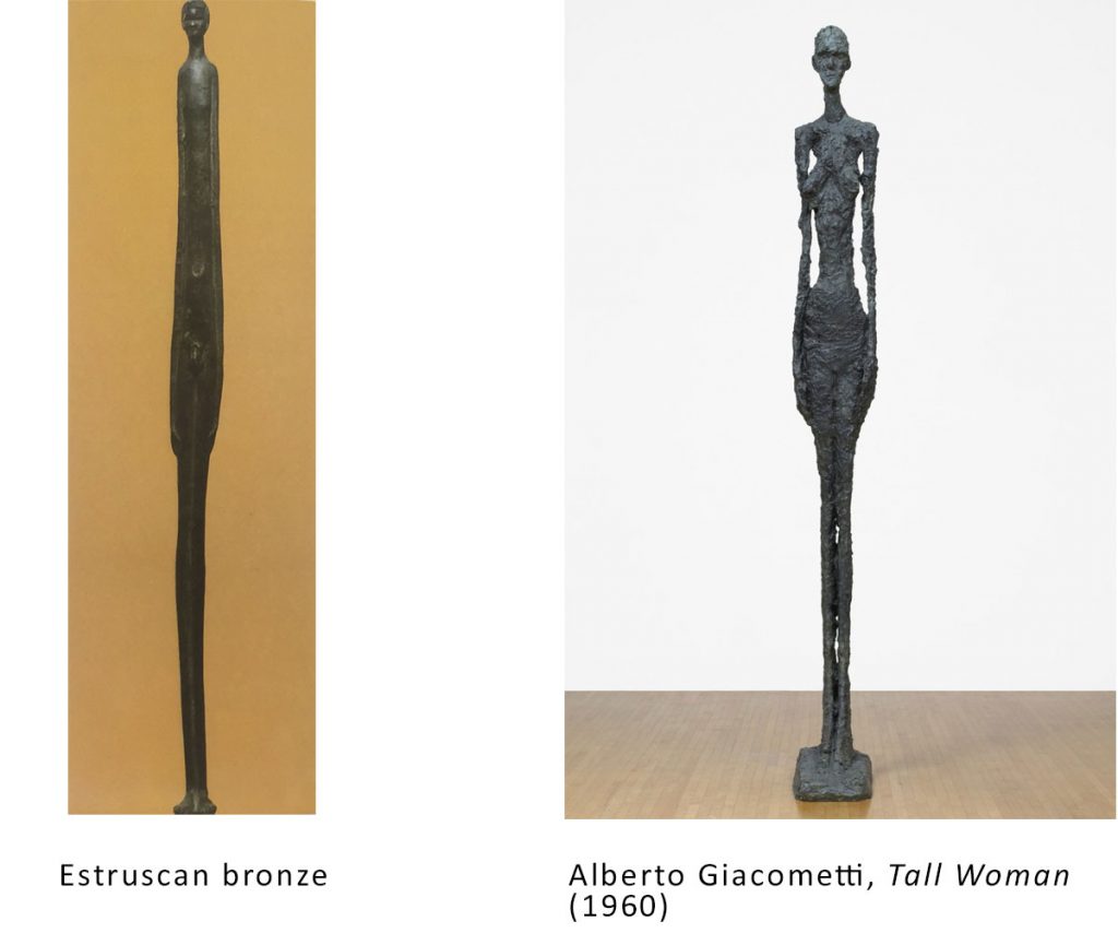
In many cases, artists were trying to re-assert the “autonomy of art,” meaning that art was a sacred realm of true human spirituality, separate from the debased bourgeois market of modern Western capitalism, including the art world.
The cultural appropriation may look abusive to us now, and no doubt there was use of non-white culture to lend freshness and life to a privileged hegemonic culture that was sort of out of ideas, but their appropriations did arguably give more attention and credibility to these works than had previously been the case in Western culture, and many of the appropriating artists felt genuine awe at the "primitive" artistry, even if they otherwise had little understanding of its original context or cared little about the lives of the people who made these works.
Appropriation of manufactured media
On the other hand, there was a readiness to bring the manufactured goods of mainstream consumer culture directly into the art, whether to overcome the commodification and reassert the abstract values of beauty, truth, and spirit, or to critique, embrace, or “paint with” the products of manufactured media.
Collage: The 20th Century Artform
Twentieth-century Modernism was the first time that mixed media was practiced by fine artists in the Western tradition, and this included collage and photomontage. Manufactured materials and media were cut up and pasted onto the canvas, often mixed with paint and other media. Picasso and Braque initiated this practice around 1910, and it was soon being adopted by all of the avant-gardes that bloomed in the decade that followed: cubism, Russian and Italian Futurism, Dadaism, Soviet Constructivism.
Picasso and Braque began experimenting with mixed media around 1910, and were soon including collage as part of their canvases, sticking pieces of the (manufactured) real world on their canvasses and making them part of the art. Much of what they stuck was mass produced printed matter, and thus a form of appropriation (using someone else’s work as part of your own work). A work like the one shown below combines painting, drawing and decoupage with pieces of printed matter (newsprint, sheet music) on a background of mass-produced wallpaper, to create a kind of Modernist take on the traditional oil painting genre of still life.
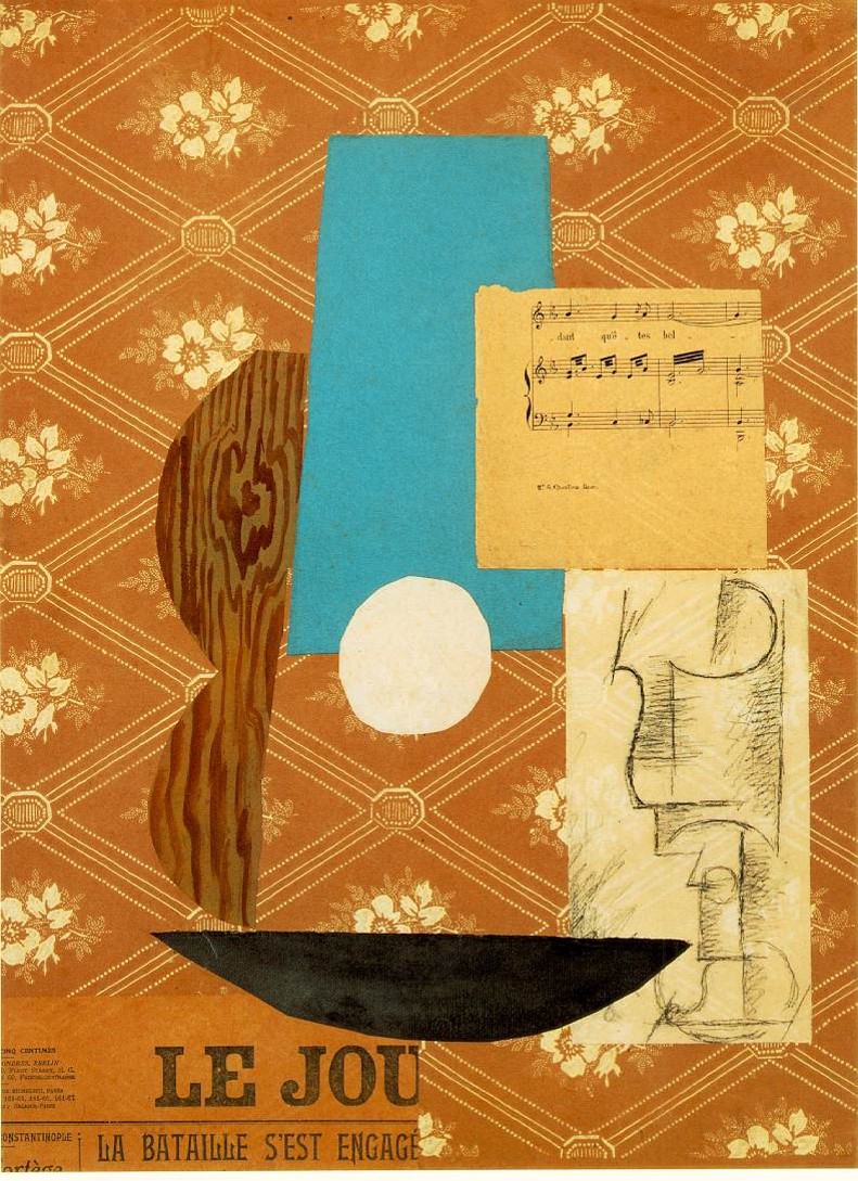
Pablo Picasso, Guitar , sheet music, and glass (1912)
The specific reasons each avant-garde artist might have for bringing these pieces of (manufactured) reality directly in their canvases varied, but some of the following could often be at play:
- To include these aspects of “vulgar” reality, which are not traditional themes of high art
- To make people feel the tension between hand-made art and mass produced images
- To critique the culture being promoted by consumerism
- To turn the dead mechanically produced product back into a hand-made human work that is unique and has spiritual “life”
- To “paint” with real things and with the creations of other people
The poet Guillaume Apollinaire, an early champion of the radical avant-garde, was ecstatic over the new possibilities for art created by including manufactured materials and media directly in the work: “One can paint with whatever one likes – with pipes, postage stamps, postcards or playing cards, candlesticks, pieces of oilcloth, detachable collars, painted paper, newspapers.” (Guillaume Apollinaire, Aesthetic Meditations, 1913)
As opposed to the “photographic” painterly reproduction of art since the Renaissance, selection and juxtaposition now become legitimate modes of artistic creation, and we can see in this the forerunners of things that have started to be recognized as art forms in our remix culture today: sampling, dj mixes, exhibit curation.
When an artist cuts out and pastes together two realities that might not have come together in the mainstream media, they can create a “dialogue” or a drama of conflict between them that then provides new possibilities in the arts.
Many of the more interesting uses of collage in early 20th century art bring into juxtaposition and dialogue different perspectives, points of view, and interests, rather like some of the better mashups and culture jams today.
So most of the “remix culture” of 20th century art is not about ripping off great works you love or plagiarizing successful masters for profit, but about trying to get us to think about or experience freshly the mass and commercial production and technologically created media, and how these can relate to authentically artistic work. It’s about taking images that are often familiar (or at least banal and cheap) and drawing our attention to them in various ways. Such art brings to the fore practices like framing, selecting, creating “dialogues” and “fights” within a single image, blowing up elements so that we can really see them and think about what we feel about them, etc.
Dadaist photomontage
Dadaism was a radical politicized artist movement in the early 20th century. 1910-1920 was a time of immense upheaval in the Western world, especially Europe: new technologies such as the telephone, radio, sound recording, and film came of age; World War I was a giant bloodbath (also partly because of new technologies: the machine gun, tank, submarine, gas, aerial bombing, etc); the communist party managed to take power in Russia and create the Soviet Union; after years of struggle, women finally received the vote in many Western democracies; and in the arts the avant-garde threw out the rule-book from centuries of practice that had been devoted to creating beautiful diversions for the privileged class.
The Dadaists wavered between excitement and nihilism, wanting to tear down art and society and also move them to the next level.
Things the Dadaists wanted us to notice and think about:
- The bourgeois culture of our day is bullshit and its values are passé
- We no longer live in nature; we live in mass media
- Our myths have died and instead we have pop culture
- Traditional art has been superseded by photography and film; the unique work of art has been superseded by cheap mechanically reproducible copies
- Our world has become highly mechanized and so have we
- Traditional high art approaches like painting landscapes, still lifes, or portraits are played out and irrelevant
- Traditional religious and philosophical views of Man as special and transcendent are no longer viable
- The world is terrifying and absurd
The Dadaists – as well as other avant-garde artists (the Italian Futurists, the Russian Constructivists) reveled in this kind of assemblage. It was an ironic comment on the uselessness of the individual artist and the outdatedness of the unique artwork in a world of cheap mass (re)production. It was an attempt to represent the reality of modern life as a mass-produced, commercial dreamscape of products, news clips, and celebrities. And at other times it could be a very pointed critique of the values of that mass commercial culture.
A work like Life and activity in Universal City at 12.05 midday (1919) by George Grosz and John Heartfield attempts to convey the chaotic bustle and overstimulation of a big city (or a cinema lot) by cutting up newspaper and magazine pages and piecing them together into a bewildering tableau of words and images competing for our attention, much like Times Square today.
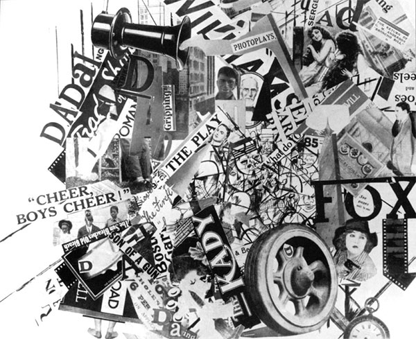
George Grosz and John Heartfield, Life and activity in Universal City at 12.05 midday (1919)
Raoul Hausmann, one of the inventors of this technique, known as photomontage, suggested that the new medium of the cinema was one of the inspirations – the movement of cinema, but also the cutting techniques, abrupt changes of perspective and scale (the closeup and then a long shot). Haussmann said photomontage was “a kind of motionless moving picture.”
Hausmann seems to have been more enchanted or ironically resigned than appalled by the mechanization of modern man. His Self-portrait as a Dadasoph (1920) shows a person who is part animal, part machine, and part anonymous mechanically-reproduced image, but not a “human being” in the rich, deep sense it had had since the Renaissance and that a traditional portrait was meant to convey (a divine and unique soul trapped in a body).
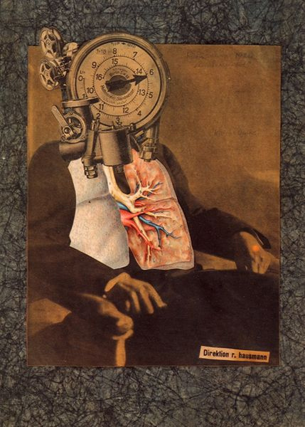
Raoul Hausmann, Selbstbildnis als dadasoph (1920)
The dadaists were interested to see how art and human beings would be transformed by technology. They were apprehensive but also excited. In 1920 when the first Dada International Fair took place in Berlin, there were large panels on the wall saying “Art is dead” but then: “Long live Tatlin’s new machine art”. The panel was surrounded by photomontages.
Vladimir Tatlin was a leading Russian artist and designer in the new Soviet Union. The Soviet avant-garde had embraced a movement called Constructivism that was focused on overcoming the outdated idea of the individual genius (and the individual in general, as opposed to the communist collective). The movement was attempting to create was was called “non-objective art”: art that wasn’t about individuals, inner feelings, etc, but rather about pure forms without the human face of angels, Greek gods, shepherds, monarchs, and other outdated humanist motifs. Like cubism and other approaches of the 1910s, it tended toward flat geometrical abstraction, formal explorations. The Marxist-Leninist doctrine of the new Russian state was fixated on industrializing the country, and manufacturing became one of the models for what the new art would be. This was the opposite of what high art had been focused on in Europe: the unique work, emotions, the transcendent human genius, individual handiwork and craft, individual genius and self-expression.
Many of the Dadaists were sympathetic to this new anti-individualist radicalism, and interested in or allied with the revolutionary ideals of the new Soviet Union (in its early days, it was not the totalitarian state that it would later become; it was a hotbed of progressive ideas and experiments). Hausmann did a piece called Tatlin at Home (1920) that portrays the mechanical thought of this new human. The “portrait” is a photomontage, with the foremost figure in it actually a photograph of an unknown man Hausmann had chanced upon in a magazine. So much for the authenticity of the unique human individual!
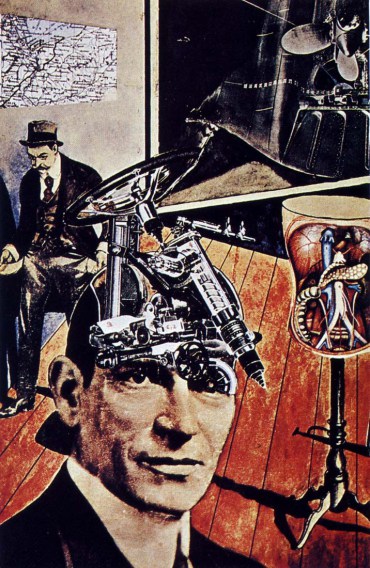
Raoul Hausmann, Tatlin at Home (1920)
Dadaism largely had an anti-humanist slant. Suggesting that Tatlin could be any man (consistent with Soviet anti-individualism) and that the machine-like rational thinking was admirable and the way of the future, the enthusiasm ties in with the photomontage work of the Russian Constructivists, generally very positive in their portrayal of mechanization and technology. (Russia had a long way to go, as it was basically an almost medieval farming-based country before the revolution, and the Soviets planned to industrialize rapidly, one of the ironies of their application of Marx’s theories.) When I say "anti-humanist" I mean resistant to the Christian and Romantic view of the human individual as a transcendent soul. Instead, there was an apprehensive but sometimes utopian exploration of the human as a hybrid entity: part animal, part technology, perhaps still part something worth believing in. (If you are interested in this early exploration of the hybrid human, you should check out the book The Dada Cyborg: Visions of the New Human in Weimar Berlin (2009) by Matthew Biro; it goes extensively into the images created by Raoul Hausmann and Hannah Höch.)
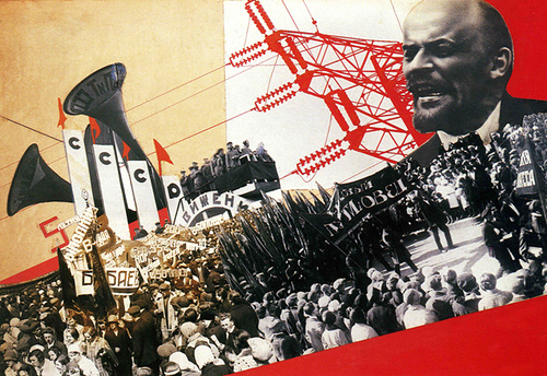
The "Constructivist" aesthetic practiced in the early days of the Soviet Union experimented with photomontage in fascinating ways. Varvara Stepanova, inside double-page spread from The Results of the First Five-Year Plan (1932).
Many Dadaists thought of themselves not exactly as artists, but as something else that had come to take the place of artists in the 20th century world: provocateurs, conceptualizers, designers, or indeed “engineers” (monteurs, in French). Photomontage was the art of the future, using the abilities of machines to reproduce both real life (photography, film, etc) and art (printing, photographic effects, and so forth). As Hausmann put it “We regarded ourselves as engineers and our work as construction … all the arts and their techniques needed a fundamental and revolutionary change, in order to remain in touch with the life of their epoch.”
A more “human,” perhaps, and more emotional kind of photomontage is to be seen in the work of my favourite of these artists, Hannah Höch. Höch was somewhat marginalized both within Dada and in the early critical response to it, due to the sexism of the time, but today she seems probably the most enduring and still interesting of the group, apart from comparatively famous Marcel Duchamp. She was certainly more dedicated and prolific than the more notorious Duchamp, who spent most of his life dabbling and playing chess.
Höch’s works often seem to be meditations on femininity and sometimes also on things like racial difference – I think they speak strongly to a recognition of the legitimacy and interconnectedness of diverse members of humanity.
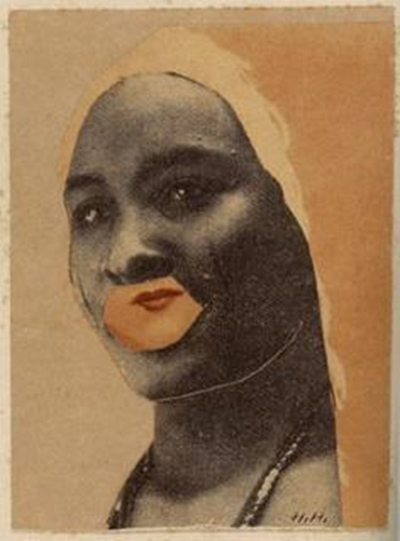
Hannah Hoch, Half-breed (1924)
One of Höch’s signature motifs is to replace the head or face of a woman with a different head, a “primitive” mask, parts of other people’s faces, etc. Often the head is much larger than the body and often, as in the untitled piece from 1921 it is staring out at us.
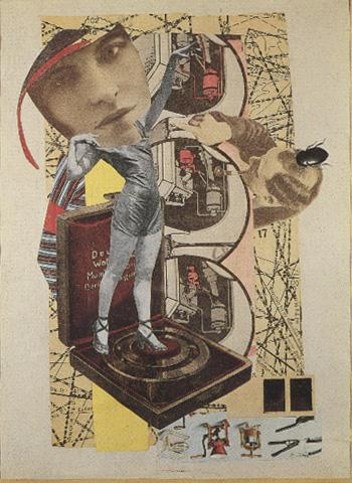
Hannah Hoch, untitled (1921)
The body here was taken by Höch from a women’s magazine of the day. It shows the dancer Claudia Pawlowa at the beach.
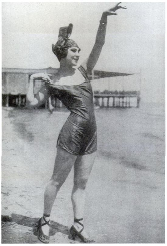
Claudia Pawlowa from Die Dame [The Lady] magazine, 1921
Höch replaces Pawlowa’s head with part of a disquieting face found in another print source, and mounts the woman on a machine of some kind, which makes her look a bit like a figurine on a music box.
Höch seems to me to often be exploring the multiplicity or fractured nature of individual human identity, specifically that of women. Her frequent Frankenstein stitching together of a "primitive" mask (or a non-white face) with parts of a modern white woman seem to me to denote a recognition of shared humanity, even if they involve appropriation from other people's culture. You will have to judge her intentions and their effects for yourself.
In the 1960s there was a "neo-Dada" movement, and the celebrated African American painter Romare Bearden did a number of explorations of black American identity, decidedly the male side of it, that seem to me to owe a lot to Dadaist photomontage, and Höch's techniques in particular. The ways in which all of us include diverse, sometimes contradictory, parts and the obviousness of that within African American experience, often fractured in ways that white identity does not at first appear to be, come through for me in Bearden's images of urban blackness.

Politicized photomontage
John Heartfield, a German whose birthname was Helmut Herzfeld, was a politically committed communist. (This was before the Soviet Union had become a totalitarianism under Stalin and then gradually shown itself to be fascism during the Cold War. Again, communism in the early days after the Russian Revolution was seen by many progressive people of conscience as the most forward-looking and humane answer to many of humanity’s problems. Its original artists were also cutting edge, if you will allow a small pun.)
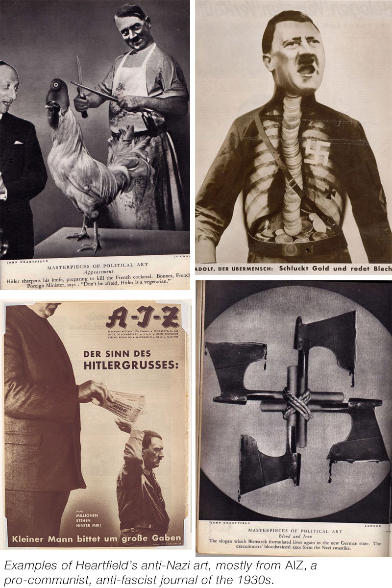
Heartfield was a pioneer in using art as a bitterly satirical political weapon. In countless absurd or increasingly grim photomontages he sent up those in power by assembling pop culture media images to create new juxtapositions.
Jedermann sein eigener Fußball
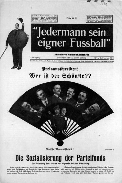
Jedermann sein eigener Fußball (Every man his own football, 1919) was meant to be satirical bimonthly of political commentary. The cover features Heartfield’s Who is the most beautiful? a montage that presents various political leaders in a fan suggesting they are competing in a beauty context or a girly magazine. The publication was immediately seized by the police when it appeared in 1919.
Heartfield remained oppositional and instrumental in critiquing those in power until he was finally forced to flee Germany when the Nazi SS came to arrest him in 1933. He was responsible for some of the most trenchant anti-Nazi propaganda of the period.
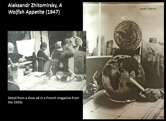
The Soviet propaganda artist Alexandr Zhitomirsky adopted some of Heartfield's techniques in anti-American photomontages he did in the 1940s, such as this image critical of Wall Street and American capitalism's insatiable appetite:
There were many other interesting uses of collage and photomontage by the Dadaists and the Surrealists. An important figure was Kurt Schwitters, who created his own “school” of collage that he called Merz. Max Ernst did fascinating things with collage. Joseph Cornell, generally considered a surrealist, created a series of famous “boxes,” three dimensional artifacts pieced together in a collage sort of way.
To explore further, you can simply Google photomontage, collage, and assemblage, or search Google Images for some the main practitioners of dadaist and post-dadaist collage:
- John Heartfield
- George Grosz
- Max Ernst
- Joseph Cornell
- Marianne Brandt
- Francis Picabia
- Marcel Duchamp
- Romare Bearden
Later collage artists influenced by the Dadaist approach include Robert Rauschenberg, Robert Motherwell, and Jess Collins.
The Readymade
The Readymade is a form of appropriation art invented and exclusively practised by Marcel Duchamp, who was connected with the Dadaists but generally distanced himself from any school of art.
The first and most famous readymade was the urinal that Duchamp signed “R. Mutt” and submitted under the title Fountain for an open exhibition of the Society of Independent Artists in New York in 1917. The Society was intended to promote avant-garde art by lesser-known or unknown artists and technically it had decided to avoid bias by displaying the works alphabetically by the last names of the artists and to exhibit any artwork submitted as long as you paid the $6 exhibition fee.
Duchamp was not just a member of the Society but the head of the hanging committee for the exhibit. Nevertheless, the Board – probably not aware that the work was Duchamp's idea – refused to exhibit the piece, telling the press “The Fountain may be a very useful object in its place, but its place is not in an art exhibition and it is, by no definition, a work of art.” The incident created public interest and some controversy in the press.
The famous American photographer Alfred Stieglitz photographed the rejected work, and later commented “Everyone who has seen it thinks it beautiful – And it’s true – it is. It has an oriental look about it – a cross between a Buddha and a Veiled Woman.”
His photograph appeared in the Dadaist journal The Blind Man later that year, with an anonymous editorial defending the work.
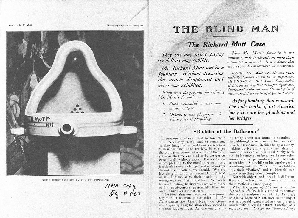
The editorial contains two ideas that became very important in 20th century art, and remain central to "high art" practice to this day. There is the idea of curatorial choice being a form of artistry, an idea that returns with the mixtape and the dj mix in music much later. And there is the idea of recontextualization/decontextualization that will lead to artistic contemplation and thereby thinking: “He took an article of life, placed it so that its useful significance disappeared under the new title and point of view – created a new thought for that object.” The idea that art was intended to make you think, as opposed to making you feel, or experience beauty or pleasure, is a constant one in the 20th century avant-garde, and Duchamp’s Fountain is arguably the first instance of conceptual art. Though Duchamp never clearly stated what his intention was, it is safe to say that it was intellectual rather than aesthetic. He claimed to be interested in breaking free from what he called “retinal” forms of art (i.e., visual ones) and remarked that “it was always the idea that came first, not the visual example.”
The gesture of presenting the found object of the urinal as art led to much reflection on the institution of the art world and the experience of art in a gallery. What exactly makes something art?
Is “art” actually not inherent in the object or the genius of the creator but rather a way of looking at something? Is art really just paying attention?
What is the role of the museum/ gallery? Does putting something a museum turn it into art? Can you put literally anything into an exhibit and then if people go and look at it closely and with quiet undistracted attention does it show itself to be interesting, maybe even beautiful?
Duchamp created a number of these pieces, which he called readymades, in the 1910s, and others throughout the next 30 years or so. One of the better known ones is the Bottle Rack, which is a rack manufactured at the time on which washed out bottles could be dried. He dreamt up new sub-categories, including the assisted readymade, where more than one manufactured article is used. The most famous of these is the Bicycle Wheel, which is also usually credited with being the first piece of kinetic sculpture (sculpture that has moving parts).
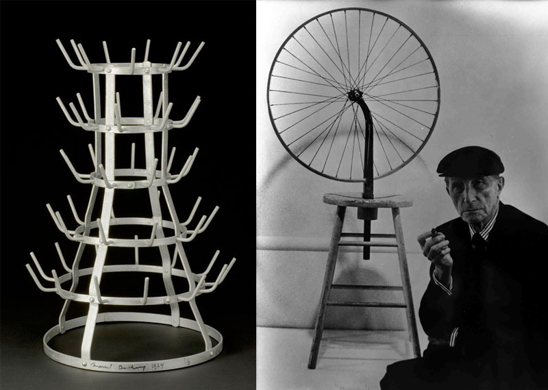
Marcel Duchamp, Bottle Rack (1914) and Bicycle Wheel (1913)
Here is a brief excerpt of a recording of Duchamp discussing his readymades in 1965:

Baroness Elsa in 1915
There is speculation now that, ironically, as minimal as Duchamp's effort may have seemed in "creating" this seminal work of 20th century art, he may not actually have been "the original artist." Among Duchamp's bohemian acquainances in New York was a woman who was unbelievably "punk" for her day, Baroness Elsa von Freytag-Loringhoven. A radical feminist when that was a new idea, she rebelled against her father, moved to Europe, had dozens of affairs and was married a few times, sometimes without a divorce. She was a free-wheeling force of nature and when she returned to New York she became involved with the avant-garde there. She dressed in a completely flamboyant and sometimes rather absurd way that was entirely her own and would have looked unbelievably "out there" in the society of the time. She wrote wild poetry and did art, and generally did her best to make her life into art.
In a letter Duchamp to his sister Suzanne in 1917, he speaks of the incident with the "Fountain": "One of my female friends under a masculine pseudonym, Richard Mutt, sent in a porcelain urinal as a sculpture." The two most likely candidates were Elsa von Freytag-Loringhoven, and Louise Norton, whose address can actuallly be seen on the entry ticket for the rejected piece. Though the person that "sent" the urinal in may have been Norton, the influence of Baroness Elsa is more obvious. She was experimenting with found-object sculpture at the time, and may have been the inspiration for the prank, which was to prove so monumental in the art world. Here are two of her surviving sculptures from that period, including one of her friend Duchamp:
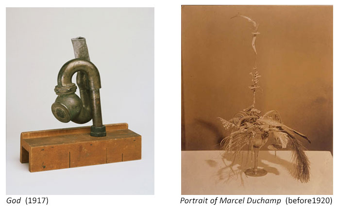
Duchamp once said of his friend: "She is not a Futurist. She is the future.” (The Futurists were one of the avant-garde movements that arose in the 1910s.)
Despite his limited output and possible figurehead status, Duchamp has come to be seen as a central figure in 20th century art, in many ways surpassing geniuses like Picasso in terms of influence, and preceding Andy Warhol in terms of postmodern irony, detachment, performance artist, and nonchalant style as an artform itself.
Pop Art
Pop art is too large a category to cover adequately here, but it’s fair to say that pop art embraces – or at least seizes on – the products of pop (manufactured mass) culture and turns them into art.
Appropriation is consequently the order of the day with much pop art. Here I'll look at a few of the most famous examples where appropriation is key to the work.
Hamilton
If we look at proto-pop British artist Richard Hamilton’s 1956 collage “Just what is it that makes today’s homes so different, so appealing?” we may be reminded of Dadaist photomontage. The elements are all cut from American magazines (many of the sources are identified in the Wikipedia article on this work).
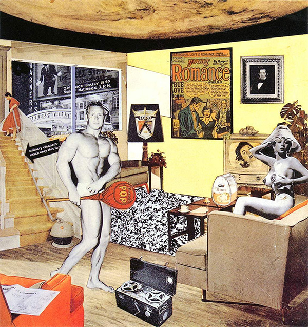
Richard Hamilton, “Just what is it that makes today’s homes so different, so appealing?” (1956)
The work highlights the reality of life and art in post-war Britain (their vulgarization and Americanization), heroicizing consumer products, pop culture, bodybuilding and porn as the focus of modern human striving. Like most pop art, there may be a touch of bitter irony here, but there is also a real acceptance of this modern world where higher ideals (and art) have been eclipsed. This is a mirror of us in a world whose values are shaped by consumer mass-media culture.
Jess
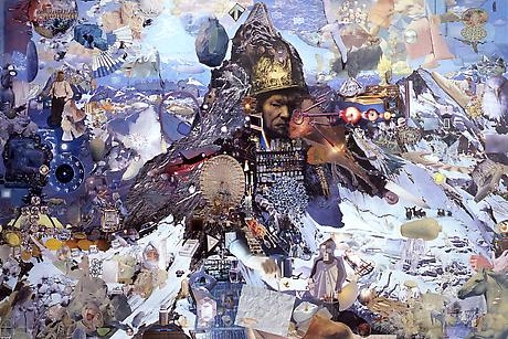
One of my personal favourite collage artists is Jess (Collins), a gay beatnik-y guy who did quite countercultural work in the 50s. One of Jess’s more surreal experiments was with Tricky Cad (1952-1959), a series of eight painstakingly recomposed fragments of cut-up elements from Dick Tracy, a popular daily comic strip of the day.
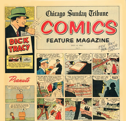

Jess. Tricky Cad (1950s)
Jess often created wildly elaborate "landscapes" through layered collage techniques that had been perfected by the Dadaists and Surrealists. Google "Jess Collins" if you would like to explore his work further.
Lichtenstein
A more famous representative of pop who also appropriated from comic books was Roy Lichtenstein. He is most famous for isolating single frames from comic books and painting them as giant wall canvases. For instance, he took this frame from Tony Abruzzo’s women’s romance comic Secret Hearts (DC, 1962)
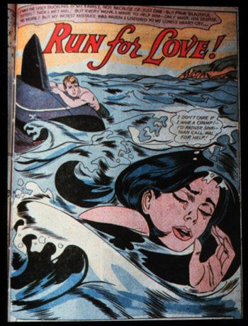
and turned it into this arguably feminist 5-ft square wall painting:
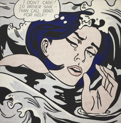
Roy Lichtenstein, Drowning Girl (1963)
Similarly, a single frame originally drawn by William Overgard for the male action comic Steve Roper (1961)
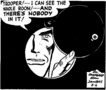
is recreated as a large canvas:
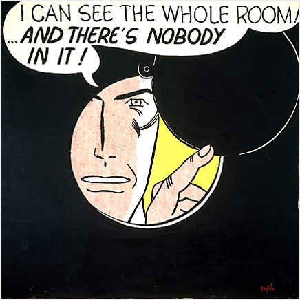
Roy Lichtenstein, I can see the whole room … and there’s nobody in it! (1961)
One can imagine the response of spectators in 1961, simultaneously confronted with a giant fragment of the cheap escapist culture they typically consume and with a seeming commentary on the emptiness of themselves as human beings. The work turns a tiny square from a comic book into an existential challenge.
Warhol
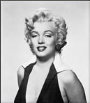
Best known of the pop artists – and the pop art appropriators – is Andy Warhol. Many of his most famous works reproduce images from the popular press in new artistic media and styles. For example, almost everyone has seen some of his many treatments of Marilyn Monroe’s face, begun a few weeks after her suicide, and done in many sizes and colour schemes over a number of years. Working from a publicity still shot by Gene Korman for the 1953 movie Niagara, Warhol created templates for the silkscreening of dozens of different treatments of the subject.
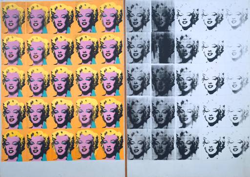
Andy Warhol, Marilyn Diptych (1962)
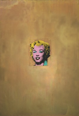
Andy Warhol, Gold Marilyn Monroe (1962)
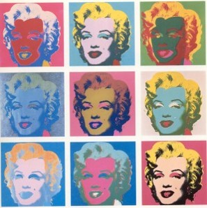
Andy Warhol, Marilyn Monroe (1967)
For Warhol, and for most of his audience, Marilyn was a more iconic subject than the Virgin Mary, Joan of Arc, Venus, Salome, or any of the more mythological figures that had been the subject of earlier Western art. Warhol’s repetition of her image also celebrated the easy and abundant repetition of mass culture, including magazines and newspapers, television and films. Though his own reproductions were not often hand-painted like Lichtenstein’s, they were generally silkscreened – i.e. reproduced by hand in a handicraft process quite different from the printing techniques of mass media. In the great variety of colour schemes used – all very unnaturalistic and echoing the loud primal colours of product labels and cartoons – the subject of the pictures ceases to be a person and becomes the fantasy reproductions of pop culture themselves. Warhol did many such series, taking images from newspapers or movie stills, and creating images of Jackie Onassis, Elvis Presley, and the electric chair, for instance.
Warhol also appropriated designs from common household products, most famously a series of Campbell’s Soup can labels and some “scultures” of Brillo boxes.
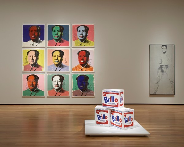
Here we see the triumph of selection over pure creation in artistic practice. The Brillo logo and the cartons were actually designed by a man who worked both as a fine artist and a commercial artist, Toronto-born James Harvey (1929–1965). Harvey never made a very big name for himself in high art circles, though he was represented by a gallery and did sell paintings in an abstract expressionist style. Millions, however, have seen the work he did for the design firm Stuart and Gunn on the Brillo account, whether it was in the supermarket or a major art museum.
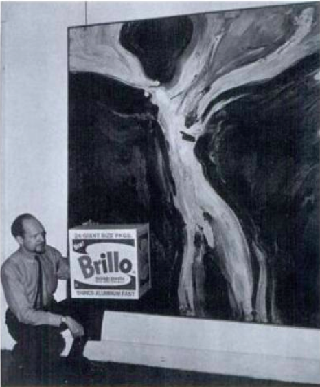
James Harvey with one of his abstract paintings and holding the more famous Brillo box
Warhol didn’t just take Brillo cartons from a supermarket; he oversaw the careful creation of wooden boxes that were painted to look exactly like the cartons. Harvey reportedly laughed off the success of the appropriation, though his gallery issued a press release complaining about how unfair it was that Warhol was getting famous from Harvey’s creation, while Harvey had difficulty getting attention for the more serious art he created as art.
The Graham Gallery, which represented Harvey’s abstract expressionist art issued a press release on behalf of Stuart and Gunn (and Harvey) that stated: “It is galling enough for Jim Harvey, an abstract expressionist, to see that a pop artist is running away with the ball, but when the ball happens to be a box designed by Jim Harvey, and Andy Warhol gets the credit for it, well, this makes Jim scream: ‘Andy is running away with my box.’” But the final line practically admitted defeat: “What’s one man’s box, may be another man’s art.”(Wikipedia)
When pop artists appropriate, it is generally from the most common and recognizable of manufactured pop culture: celebrities, ads, movies, consumer products. Sometimes they want to find the beauty in these familiar things, sometimes to make us think about them and what they say about us as a society, and sometimes they just want to defamiliarize things we have all seen so many times that we no longer really see them. (And sometimes, of course, they may just want to capitalize on their "relatability" for people's whose only art is pop culture.)
Ironically, Warhol’s own works perhaps now fall into this category. As he would be the first to admit, and celebrate, his art works were also consumer products, and they were incorporated into the manufactured pop culture to leave the world of high art behind in many ways. It is hard to see them with fresh eyes today, partly because they have been so exhaustively reproduced in commercial products and mainstream media. Just as Lichtenstein’s giant comic book frames spawned a whole sub-genre of greeting card and poster art and was thus reabsorbed into manufactured culture, so Warhol’s appropriations of that culture have been reproduced and become part of the same dumbed down, cheapened, and mainstream culture. For pop art, there may be little meaning to a high art that would somehow transcend the realm of commodification and meaningless enjoyment. So much for the avant-garde as an oppositional force!
Appropriation Art
Well, mostly. A few artists have clung to the desire to continue to challenge the art world, and make the public think. And their works don't usually appear on t-shirts. (Barbara Kruger might be an exception.)
All remix culture is technically “appropriation art,” especially techniques that essentially take things already created and use them directly and virtually unchanged, like Duchamp’s readymades.
However, in the 1980s the term was used by or to refer to a few influential artists who took material by other creators and exhibited it with little change as their own work. The general intention was to make the viewer think about the “politics” and implications of culture as it is consumed, and especially about appropriation itself, and what artists themselves appropriate and whether or not that is, er, “appropriate.” So the art was conceptual art, and the use of appropriation was meant to be political and critical.
Levine

Sherrie Levine, After Walker Evans: 4 (1979)
Probably the most famous example of this was Sherrie Levine’s "rephotographing" of the world-renowned photographs of Walker Evans in her installation After Walker Evans (1979). Backstory: In 1936, in the middle of The Great Depression, Evans had photographed a family of sharecroppers in Alabama. His exhibition “First and Last” was meant to show the power of his photography to capture the strength and dignity of these impoverished Americans.
In 1979 in Sherrie Levine rephotographed Evans’s photographs from the exhibition catalog and displayed them as her own works in a show. Everyone in the gallery art world would have recognized them immediately, so there was no attempt here at plagiarism. Rather she was appropriating in the most barefaced way, showing how meaning can change with context, and how appropriation is always politically charged.
Levine’s “prank” was controversial and opened up discussion on a number of levels: the appropriation of a male artist’s work by a feminist artist; the question of Evans’s original “appropriation” of the souls and suffering of the sharecroppers for his own lucrative high-art purposes, the now common of questions of “what is art?” and “what is originality?” and many other points. Is there legitimate appropriation?
In particular, Levine’s use of Evans’s shot of Allie Mae Burroughs looking you straight in the eye with her mouth enigmatically twisted a bit, led people to question, with hindsight, not just her predicament as a poor person in the depression, but also as a poor person, and a woman, being objectified by a privileged male observer who is essentially profiting – aesthetically and financially – from her position of inequality. So Levine would probably have argued she was reclaiming the voice of the depression-era woman that had been silenced and turned into art in the 1930s by turning it into politicized conceptual art in the 1980s.
Prince (no, not that Prince)
Richard Prince is another well-known practitioner who has been labelled an “appropriation artist,” famous for taking the photographs from magazine ads for Marlboro cigarettes that featured The Marlboro Man, and blowing them up to giant tableaus on the wall of a gallery, presenting them as his own art.
The “Marlboro Man” was a rugged cowboy and loner used in a long-running series of ads and commercials (you used to be able to advertise cigarettes on tv). The image of the self-contained man was meant to appeal to men in the audience and to encourage them to smoke the cigarettes to show their own toughness and freedom. Prince’s giant appropriations served to force people to look at the values being reinforced by commercial culture and the view of masculinity it was promoting.
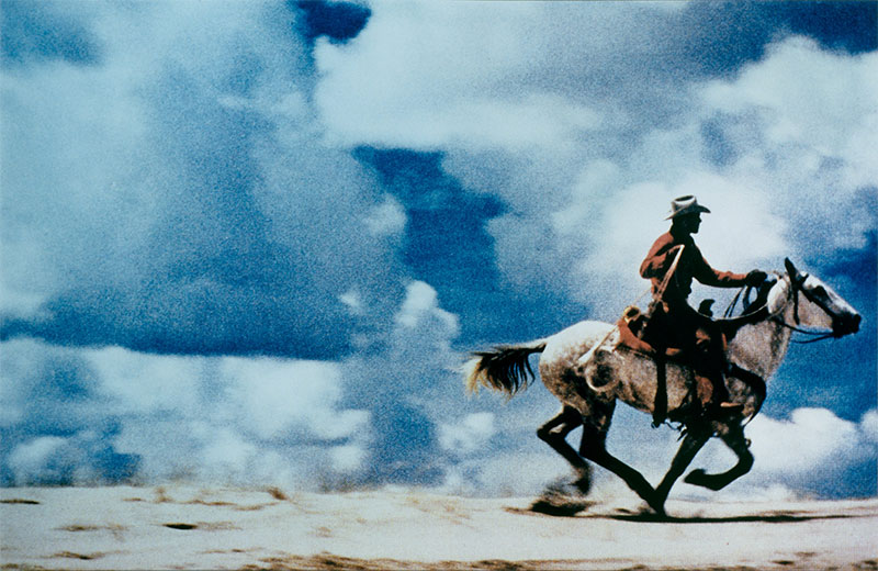
Richard Prince, untitled (Cowboy) (1989)
Prince is still active today and in 2014 exhibited a series of enlarged panels from posts by his Instagram friends as New Portraits (2014). Because they are by Richard Prince they were priced at close to $100,000 each.
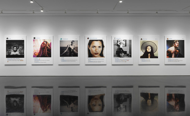
Perhaps Appropriation Art calls into question whether fine art or high art still exists in any meaningful way (except, perhaps, as commodity), and it certainly seems like a last gasp of any belief that appropriation can be part of the avant-garde, a revolutionary force for consciousness-raising leading to change in the world.
But that remains to be seen.